Hoxhunt — April 2026
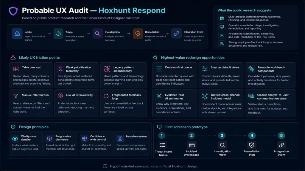
A speculative redesign of Hoxhunt Respond, Hoxhunt’s incident response product within its broader human risk management platform, using A.I. assistance for quick turnaround.
Tämä portfolio esittelee UX/UI-suunnittelun ja tuotestrategian ammatillista työtä yrityssovellusten, terveydenhuollon, logistiikan ja julkisten palveluiden parissa sekä valikoituja henkilökohtaisia projekteja kirjoittamisen, musiikin, grafiikan ja pelisuunnittelun alueelta.
Esillä olevat projektit osoittavat tutkimuksen, vuorovaikutussuunnittelun, prototypoinnin, palveluajattelun ja design system -työn käytännön sovelluksia. Sivusto on edelleen valikoiva eikä vielä kattava.
React · TypeScript · Tailwind CSS · Figma · User Research · Prototyping · Design Systems
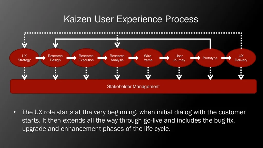
Autan tuotteita, palveluita ja sisäisiä järjestelmiä löytämään paremman rakenteen, vahvemman vuorovaikutuksen ja viimeistellyn esitystavan.