Hoxhunt — April 2026
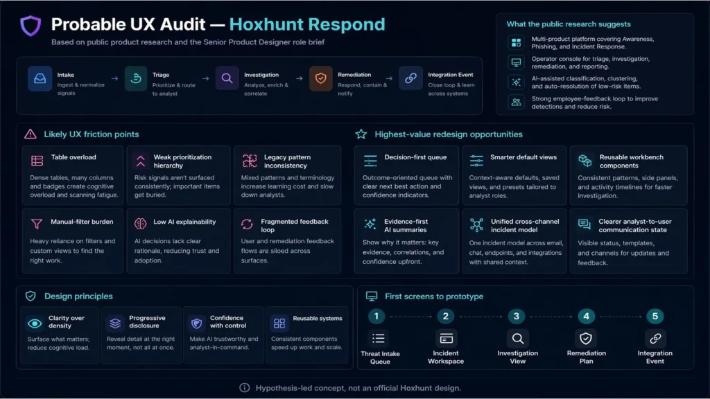
A speculative redesign of Hoxhunt Respond, Hoxhunt’s incident response product within its broader human risk management platform, using A.I. assistance for quick turnaround.
This portfolio presents professional work in UX/UI design and product strategy across enterprise applications, healthcare platforms, logistics systems and government services, along with select personal work in writing, music, graphics and game design.
The projects here show user research, interaction design, prototyping, service design and design systems shaped through real engagements. The site is still selective and not yet exhaustive.
React · TypeScript · Tailwind CSS · Figma · User Research · Prototyping · Design Systems
I help products, services and internal systems find a clearer structure, stronger interaction and a more persuasive presentation.