Site Notice

This site is still in alpha phase, but published to show the new face. I'm actively working to iron out bugs, rewrite, pour in content (PDFs, videos, slideshows, images) and improve and polish things.

Compliance Portlet Mockups

Loading deck…
Loading deck…

Problem

ControlScan's SecureEdge landing page compliance portlet lacked clear visual hierarchy and at-a-glance status communication, forcing users to parse text to understand compliance state instead of seeing status instantly through visual design.

What I Did

Redesigned compliance portlet with color-coded status indicators | Added iconography to reinforce compliance states at a glance | Integrated contextual actions for immediate response to compliance issues

Impact

Transformed passive status display into actionable dashboard component | Reduced cognitive load through clear visual status communication | Enabled faster response to compliance issues through integrated actions

Lessons

'Dashboardiness' is real—dashboards should communicate status at a glance, not require reading. Color, iconography, and hierarchy aren't decoration, they're the information architecture of visual understanding. This design sought to improve the 'dashboardiness' of the compliance portlet on the landing page. The idea was to reinforce status with color and iconography, while providing quick contextual actions in a compact, at-a-glance footprint.

Related Projects

Portal Mega-Menu Wireframes (SP2013) teaser image
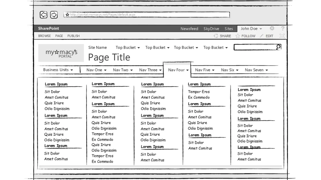
Macy's Technology — September 2016
Wireframes depicting various scenarios for a redesigned portal navigation scheme, especially a new mega-menu, in conjunction with the SharePoint 2013 upgrade.
ProfessionalAppsDocs
ControlScan — March 2020
This design improved the workflow for ControlScan partners to process and/or correct invalid contact info for their subordinate merchants.
ProfessionalApps
Scan Target Setup Wizard Demo
ControlScan — March 2020
Some users had difficulty self-identifying their network configurations for vulnerability scans. Whereas advanced users were accustomed to the existing UI, new users needed a more "hand-held" approach. Enter the Wizard, with its SAQ-like presentation layer, step-by-step workflow and on-demand help.
ProfessionalAppsMedia